The “real” color mixing of Rebelle 7 is one of it’s best features. This is why I like working with it. As advertised the software faithfully replicates the experience of working with real paints – be it watercolor, acrylic, or oils. (It also has pastels, charcoal, pencil and inks). I can use it to mix up color sets just like I would do with oil paints to explore a palette and to understand color. One of my favourite experiences of painting is the wonder of color. It feels like it should be an innate ability to mix colors but it constantly surprises me what colors you get and the sheer variety of them from just a few base colors.
I took the example of the Zorn Palette. This is a limited color set based off a Yellow Ochre, a bright Cadmium Red and a Lamp or Ivory Black. There is lots of informative posts on the web about Anders Zorn and recreating his palette so I wont go into it but this post is a reasonably complete account: https://michaellynnadams.com/zorn-limited-palette/
I started off by scanning in the Art Spectrum Artist Oils Color Chart (available here https://artspectrum.com.au/wp-content/uploads/2016/04/AS-Artists-Oils-105-Colours.pdf). These are the oil paints I have been using for a couple of years and I like that they are a local company and have a high quality product. I imported this color chart as a reference image into Rebelle 7 and used the color picker to select the relevant colors. I did tweak them slightly for my preference by bumping the brightness of the red up and added slightly more blue into the lamp black (only maybe 1 or 2 values).
These are the starting colors:


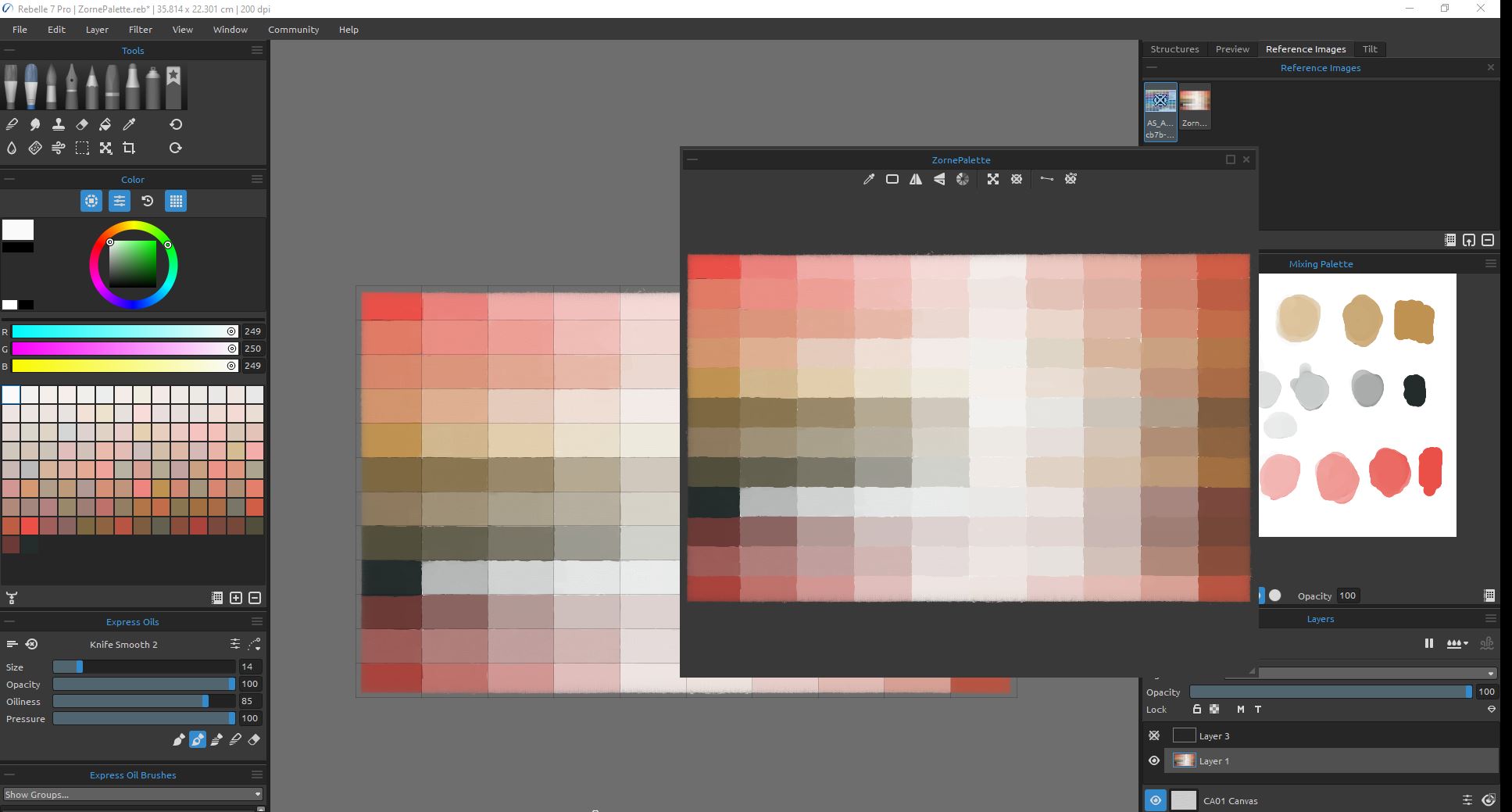
To make the palette (see image below) the colors are laid out in a grid. Mixed in the first column is the pure colors gradually mixing between the Cadmium Red, Yellow Ochre and Lamp Black in a rough gradient of 25% each step.
The next four columns add Titanium White in increments of 25%, 50%, 75% and 95%. On the left of the image is the partially complete grid and on the right is the mixing palette where the colors are created. This is exactly the same process that I use when working with real oil paints with the added advantages of working digitally (like no mess or smell, no wasted of paint, control over the environment, and the miracle of the undo button).

The right side of the canvas is treated similarly except starting at the last row with the full color hues and working back towards the center mixing in Titanium White. The difference between the two sides is that the base mixing of two colors is complimented with the addition of a small amount of the third. For example starting in the top right hand corner I am mixing Cadmium Red and moving down the column in the first 4 rectangles towards Yellow Ochre (same as the first column) except now I’m also adding just a touch of the third color in the base set Lamp Black.

What I find really pleasing is the mix of fine colors in the grey or pastel middle section of the palette. The difference between colors is subtle but very beautiful.
The effect is better when you zoom in on them to concentrate.

To finish off I start a new palette and mechanically add each of the colors using the color picker.

I use the sort feature of the color section to make it easier to pick colors but it’s not the same logical breakdown of color that you get from the palette.

Another trick I use to be able to use my original palette as a color source is to export the canvas as a *.png file (I usually use *.png as it’s compression method is the least “lossy”). After I have the image exported I import it back in as a Reference Image. This way I can have the palette in all it’s logical gradations sitting on the screen as a reference and can use the color picker built in to the reference window to choose colors.

There is a small variation in some of the color values as a result of exporting the image and uploading it as a reference. You can check them by picking the rectangles with the color picker in the Reference Image and comparing them to what the actual color is in the image using the normal color picker. The variations tend to occur in only a few select ranges and honestly they are so small that I couldn’t really detect them with my eyes.
